
An accessible website is one everyone can use: someone without a mouse, someone with a screen reader, someone with low vision. You can make a WordPress site accessible yourself if you take it step by step and in the right order. Below are ten steps, and for each one we say where in WordPress you do it.
We make AcceGuru WordPress Accessibility Plugin, and we explain where it can help. Where no plugin can help, we say that plainly too.
The short answer
- Scan the whole site and find out where the problems are.
- Fix theme issues: the skip link, a visible focus outline, the page language.
- Test your menu with the keyboard.
- Put your headings and link text in order.
- Add alt text to images and captions to videos.
- Check color contrast and page zoom.
- Label every form field.
- Publish an accessibility statement.
- Listen to your site with a screen reader.
- Check new posts so you don’t lose what you fixed.
What an accessible site means
Accessibility has a common international standard: WCAG, the Web Content Accessibility Guidelines. It has three levels: A, AA and AAA. Level AA is the target for most websites and most laws. The latest version is WCAG 2.2.
In plain words, on an accessible site:
- you can do everything with the keyboard, without a mouse;
- a screen reader can tell what is on the page: where the menu is, what the headings are, what an image shows, what a button does;
- text is easy to read, and nothing breaks when you zoom in;
- videos make sense without sound, and forms can be filled in without color hints.
WCAG is used to shape accessibility requirements, for example in the US and the EU. But the actual obligations depend on the country and the type of organization. We cover the laws in our article WordPress ADA compliance plugin for WCAG checks and fixes.
Install free from WordPress.org (opens in a new tab) Start 14-day free trial (opens in a new tab)
Step 1. Find out where the problems are
Start by finding out what needs fixing. Scan the site first and get a list of issues.
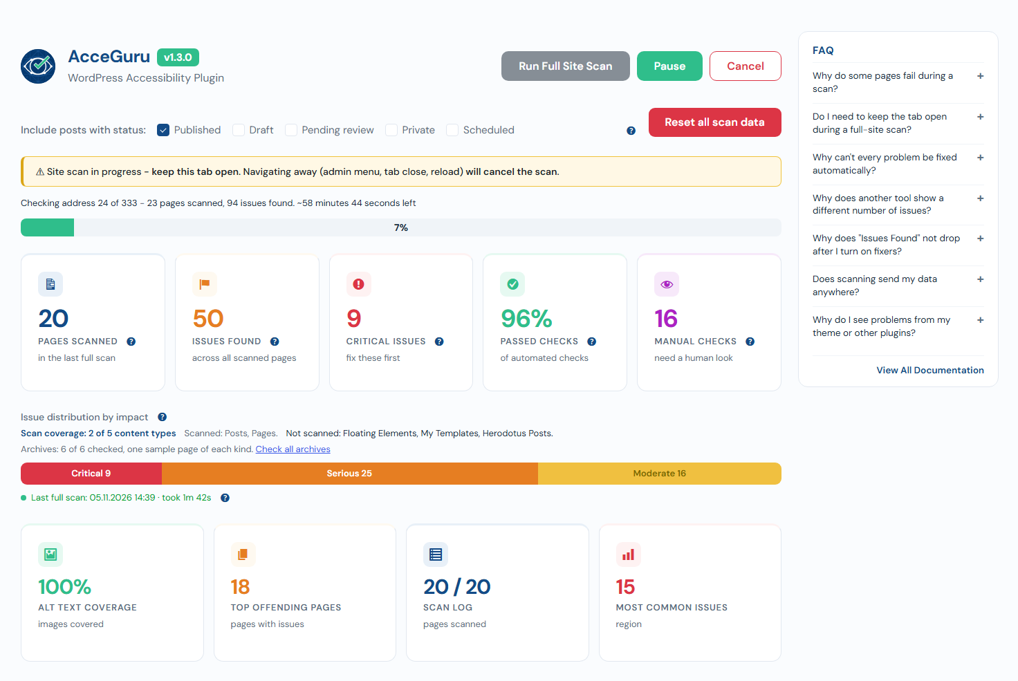
An automated scan of the whole site. AcceGuru scans all posts, pages, public post types and WooCommerce products for free in a single run. It checks against WCAG 2.0, 2.1 and 2.2 at the level you choose, with optional Section 508 rules. You get a list of issues across the whole site, sorted by impact. Issues that repeat on every page almost always come from the theme or the menu, so start with those.
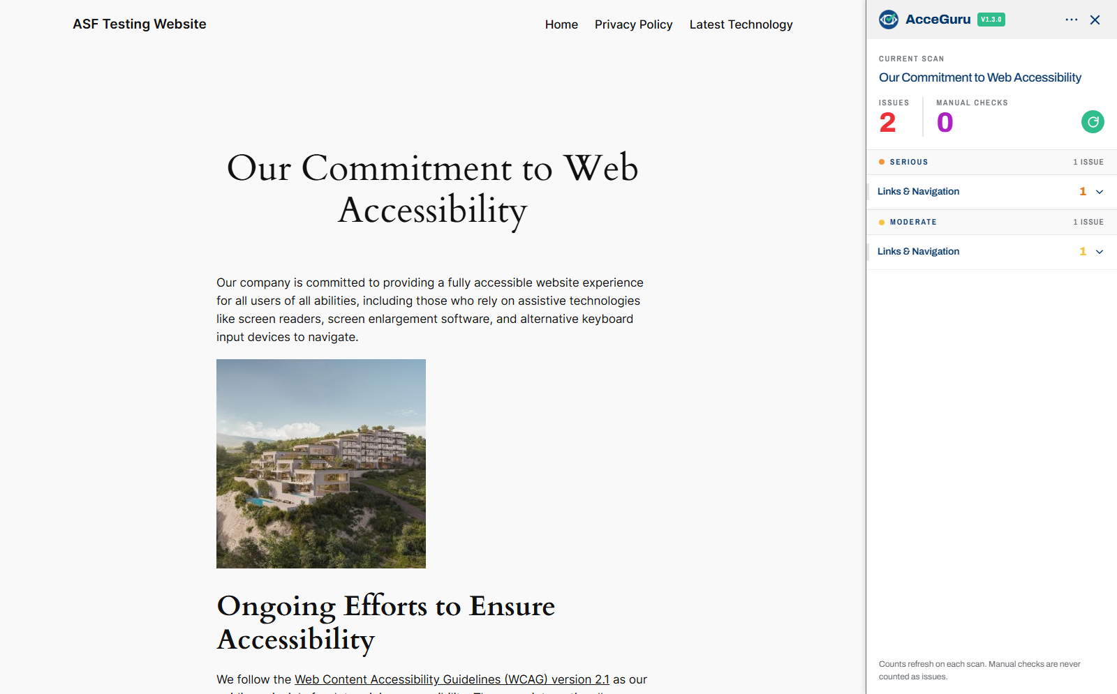
Each page’s issues also show on the page itself: AcceGuru opens a panel beside it with the issues by impact and highlights the spots on the page.
To check a single page, the free online tool WAVE (opens in a new tab) works well.
Five minutes with the keyboard. Open your home page, take your hand off the mouse and press Tab. Watch whether you can see where you are, and whether you can reach the menu, the search and the forms. An automated scan will not show you this.
Where in WordPress: AcceGuru → Dashboard, the Run Full Site Scan button. Results appear in the plugin dashboard, in a column on the posts list and in the editor sidebar.
Step 2. The theme
The theme controls what appears on every page: the header, the menu, the footer, how links and buttons look. One theme issue repeats across the whole site, which is why the theme comes second.
If you are choosing a new theme, look for the accessibility-ready (opens in a new tab) tag in the WordPress.org theme directory. A theme gets this tag after a review against the WordPress requirements (opens in a new tab): a skip link, keyboard support, labeled form fields, a meaningful heading structure, underlined links in text, enough contrast and more. The tag is a good start, not a guarantee: the theme will not fix your text, images or plugins.
If you can’t change the theme, common issues can be fixed without code. AcceGuru has 13 free fixes, and nine of them are on right after install:
- a “Skip to content” link for people who move through the site with the keyboard;
- a visible outline around the focused link or button;
- the page language for screen readers;
- labels for the search and comment fields;
- removing the block on zooming the page on phones;
- removing a forced Tab order.
Four more fixes are switched on by hand, because they change how the site looks: underlined links in text, a warning on links that open a new tab, a marker on links to documents, and controls for autoplay videos.
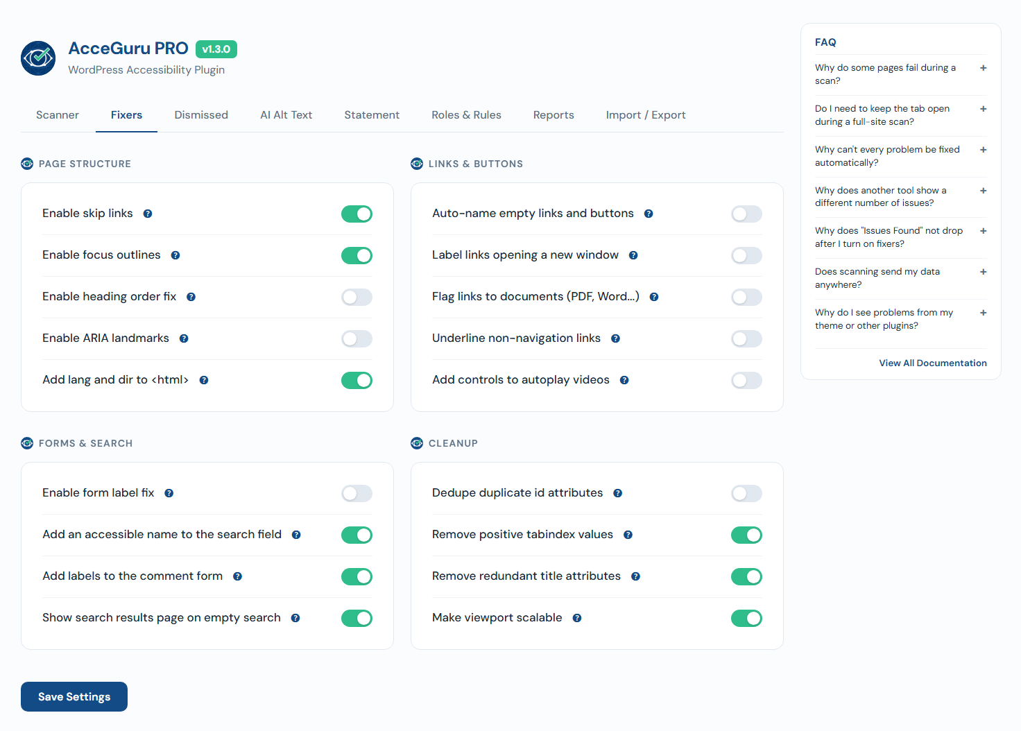
Where in WordPress: a new theme: Appearance → Themes → Add New Theme, then Feature Filter → Accessibility Ready. Fixes: AcceGuru → Settings → Fixers.
Step 3. An accessible WordPress menu
The menu is on every page, and if it doesn’t work with the keyboard, a person without a mouse can’t get past the home page. A plugin only helps here in part: an automated scan finds a link or button without a name and weak contrast, but it can’t tell how the menu behaves with the keyboard. On our test site, AcceGuru found placeholder links in the menu but did not notice that a submenu wouldn’t close with Escape. Every automated scan works this way, so the keyboard test is yours to do.
The five-key test
| Key | What should happen |
|---|---|
| Tab | Focus moves through the menu items from left to right, with a visible outline around the current one. |
| Shift + Tab | Focus moves back. |
| Enter on a link | The page opens. |
| Enter or Space on a submenu button | The submenu opens or closes. |
| Escape | An open submenu closes, and focus returns to the submenu button. |
Repeat the test in a narrow browser window, where the menu collapses into a button. You should be able to open the menu with the keyboard. When you close it, focus should return to the menu button.
What a good menu has
- Submenus open with a button, not only on mouse hover. Otherwise keyboard and phone users can’t open them.
- Focus is always visible. If there is no outline, turn on the focus outline fix in AcceGuru.
- Clear item names. “Services” and “Pricing” beat “Learn more” and “More”. Screen reader users often listen to the list of links on its own, away from the page.
- Not too many levels. A submenu inside a submenu is hard to use with the keyboard and on a phone.
- Buttons are easy to tap. Make the tap area at least 24 by 24 CSS pixels. For smaller controls, WCAG 2.2 allows an exception when there is enough space between them and adjacent buttons or links.
Where to edit the menu
Block themes (for example, Twenty Twenty-Four and Twenty Twenty-Five). The menu is the Navigation block. Its settings have a Display section: there you choose how submenus open (on hover or on click), turn on the arrow next to items with a submenu, and set when the menu collapses into a button (WordPress documentation (opens in a new tab)).
We tested each option with the keyboard on WordPress 7.1 with the Twenty Twenty-Four theme:
| Setting | What happened |
|---|---|
| Submenus open on click | The item with a submenu becomes a button. Enter and Space open the submenu, Tab moves into it, Escape closes it and returns focus to the button. Everything works. |
| On hover, arrow on | An arrow button appears next to the item. With it, everything works just as with open on click. |
| On hover, arrow off | The submenu opens when focus reaches the item. But Escape does not close it, and a screen reader can’t tell whether the submenu is open or closed. |
| Menu collapsed into a button | Enter opens the menu, focus moves inside and stays there. Escape closes the menu and returns focus to the button. |
The takeaway: in our test, open on click and the arrow both worked well. But a theme can change how the menu behaves, so a single setting does not guarantee accessibility. After you change the settings, always run the five-key test.
Classic themes. You edit the menu items under Appearance → Menus, but the theme decides how the menu behaves. If submenus don’t open with the keyboard, no setting will fix it: you need another theme or a developer to fix the theme.
A visitor widget won’t fix a broken menu either: it doesn’t change the theme’s code.
Where in WordPress: block theme: Appearance → Editor → Navigation. Classic theme: Appearance → Menus.
Step 4. Headings and text
Screen readers let people jump from heading to heading, like a table of contents. If headings were picked by font size, that table of contents makes no sense.
- One main heading per page. Usually it is the post title, and the theme displays it.
- Levels in order. Use a level 3 heading for a subsection within a level 2 section. Avoid skipping heading levels, for example from level 2 straight to level 5. Need smaller text? Change the style, not the level.
- Clear link text. Not “click here” but “download the price list (PDF)”. A link should make sense without the text around it.
- Make lists with the List block, not lines starting with dashes. Then a screen reader announces how many items the list has.
- The site language is set correctly. Screen readers use it to choose the pronunciation.
AcceGuru finds skipped heading levels and empty links across the whole site. Whether link text is clear, only a person can judge.
Where in WordPress: a post’s heading structure: the Document Overview button in the editor’s top toolbar, Outline tab. Site language: Settings → General → Site Language.
Step 5. Images and video
Alt text is what a screen reader reads instead of the image. Describe what matters about the image in that spot on the page: “Sales chart for 2026, growing every quarter”, not “image1.jpg”. If an image is only decoration, leave the alt text empty and the screen reader will skip it.
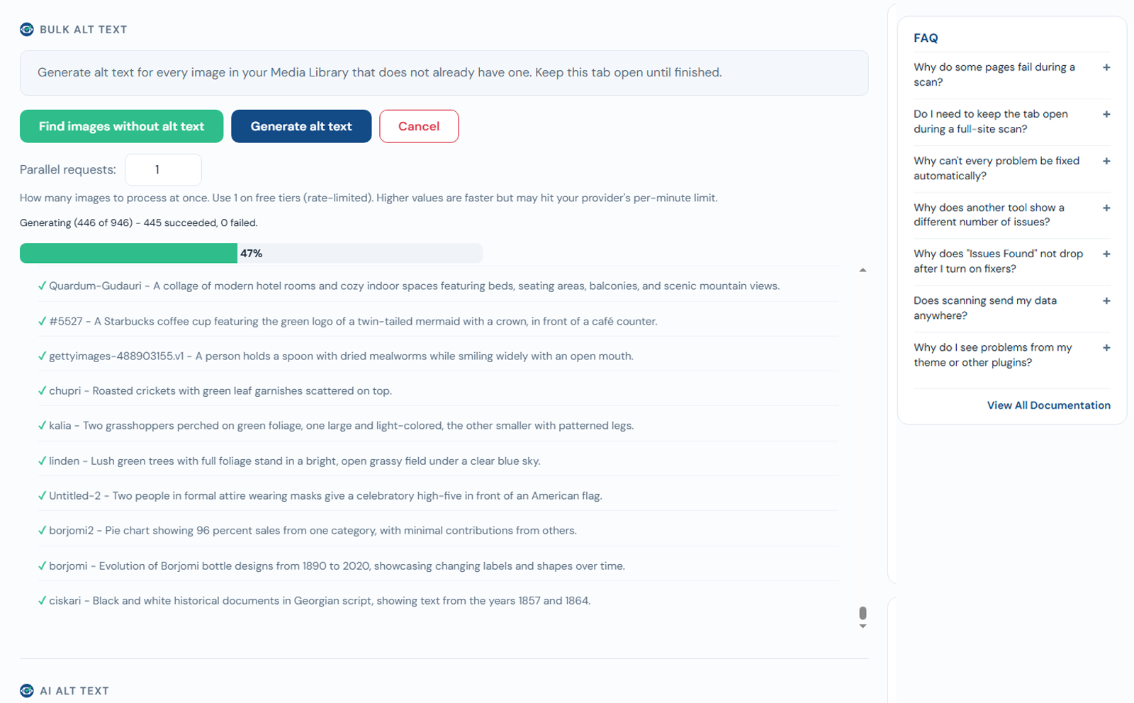
Older sites usually have hundreds of images without alt text. AcceGuru writes alt text with AI using your own OpenAI, Anthropic, Gemini or Mistral key, including for many images at once. The feature is free: you only pay your AI provider. After generating, review the alt text of important images and correct anything inaccurate: the AI doesn’t know why the image is on the page.
Video. Add captions to anything with speech. Don’t turn on autoplay with sound. If a video still plays by itself, an AcceGuru fix adds playback controls to it.
Where in WordPress: alt text: Media → Library → the image → Alternative Text field, or in the Image block settings. Captions and autoplay: in the Video block settings.
Step 6. Color, contrast and zoom
Light gray text on a white background looks stylish but is hard to read. WCAG asks for a contrast of at least 4.5 to 1 between normal text and its background, and at least 3 to 1 for large text. Field borders, icons and buttons must stand out from the background too, at least 3 to 1.
The second rule: don’t convey meaning by color alone. Mark required fields with text, such as “Required”, as well as color.
AcceGuru finds low-contrast text on every scanned page. Where contrast can’t be checked automatically, for example text over an image or a gradient, it marks the spot for a manual check.
Page zoom. People with low vision need things bigger, and your site shouldn’t break when they zoom in. The test takes two minutes:
- Zoom the browser to 200%: Ctrl and +, on a Mac Cmd and +. Text isn’t cut off, elements don’t overlap, nothing disappears.
- Make the browser window 1280 pixels wide and zoom to 400%. That equals a width of 320 CSS pixels, like a narrow phone. Body text should be readable without horizontal scrolling. Tables, maps and diagrams may scroll horizontally.
If something breaks, the cause is almost always the theme: tell the theme developer or switch themes.
Where in WordPress: colors in a block theme: Appearance → Editor → Styles → Colors. In a classic theme: Appearance → Customize, in the colors section if the theme has one. Test page zoom in your browser. No WordPress configuration is needed.
Step 7. Forms
- Every field has a label. Placeholder text inside a field disappears as you type and doesn’t count as a label.
- Errors are explained in words. “Enter an email address like name@example.com”, not just a red border.
- The form can be filled in and sent with the keyboard. Go through it with Tab all the way to the submit button.
- The “I’m not a robot” check must not rely on sight alone. Choose an option that works without pictures.
AcceGuru labels search and comment fields automatically. Forms from form plugins are set up in those plugins: make sure every field has its label turned on.
Step 8. Accessibility statement
An accessibility statement is a separate page where you say which standard the site aims to meet, what isn’t fixed yet and how to report a problem. It shows that you work on accessibility and gives people a way to reach you if something doesn’t work.
In AcceGuru the statement is built from a few fields: your organization name, a contact email and the target WCAG level. The text automatically includes a summary of the latest scan and the WCAG 2.2 requirements that only a person can confirm. The plugin can also add a link to the statement in the footer of every page.
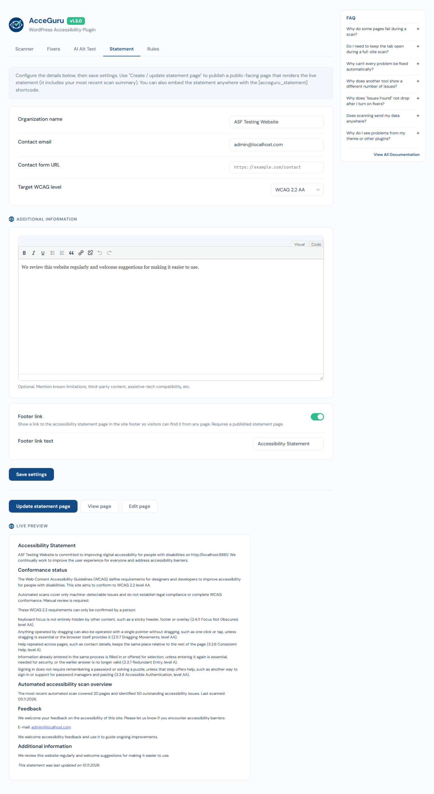
Where in WordPress: AcceGuru → Settings → Statement, the button that creates the statement page.
Step 9. Listen to your site
Ten minutes with a screen reader will show you what your eyes can’t. On Windows, NVDA (opens in a new tab) is free; on a Mac, VoiceOver is built in. Here is all you need:
| Action | NVDA (Windows) | VoiceOver (Mac) |
|---|---|---|
| Turn on | Ctrl + Alt + N, if this shortcut was enabled during installation | Cmd + F5 |
| Read from the current spot | NVDA + ↓, or NVDA + A in the laptop layout | VO + A |
| Stop speech | Ctrl | Control; press it again to resume |
| Next heading | H, previous Shift + H | Through the rotor, see the next row |
| List of headings and links | NVDA + F7 | VO + U, switch lists with the left and right arrows |
| Turn off | NVDA + Q | Cmd + F5 |
The NVDA key is usually Insert. The VO key is Control and Option together, or Caps Lock. Sources: NVDA commands (opens in a new tab), VoiceOver User Guide (opens in a new tab).
What to listen for:
- Open the home page and listen to the start: is it clear what the site is?
- Move through the headings. Do they read like a table of contents?
- Open the list of links. Does each link make sense without the text around it?
- Open the menu and a submenu.
- Fill in a form and listen to what you hear when there is an error.
Step 10. Don’t lose what you fixed
Every new post can bring new issues: an image without alt text, a skipped heading level. To keep the site accessible:
- watch the AcceGuru column on the posts list: it shows where issues remain;
- rescan the whole site after big changes and about once a month;
- in AcceGuru Pro, a post is checked when it is saved, and the author sees the issues right away.
How to make a WordPress website ADA compliant
There is no official ADA compliance certificate, and no plugin can issue one. For state and local governments, the US Department of Justice has set WCAG 2.1 Level AA as the standard. After the 2026 extension, the deadlines are April 26, 2027 for governments serving 50,000 people or more and April 26, 2028 for smaller ones and special district governments (ADA.gov (opens in a new tab)). For private websites the law sets no exact technical standard, but in practice WCAG Level AA is the usual benchmark.
What to do in practice:
- work through the ten steps above with WCAG 2.1 or 2.2 Level AA as your target;
- keep your scan results: they show that you have been working on accessibility;
- publish an accessibility statement with a contact for complaints, and answer them;
- for higher-risk sites, such as online stores in the US, order a manual audit from specialists.
Don’t rely on a widget panel. In 2025 the US Federal Trade Commission ordered accessiBe to pay $1 million over claims that its widget makes websites WCAG compliant (FTC announcement (opens in a new tab)).
Install free from WordPress.org (opens in a new tab) Start 14-day free trial (opens in a new tab)
The whole guide in one table
| Step | Where in WordPress | How to check |
|---|---|---|
| 1. Find the problems | AcceGuru → Dashboard | AcceGuru, WAVE, keyboard |
| 2. Theme | Appearance → Themes; AcceGuru → Settings → Fixers | AcceGuru, keyboard |
| 3. Menu | Appearance → Editor → Navigation, or Appearance → Menus | Five keys, narrow window |
| 4. Headings and text | Editor → Document Overview | AcceGuru, screen reader |
| 5. Images and video | Media, Image and Video blocks | AcceGuru |
| 6. Contrast and zoom | Appearance → Editor → Styles, or Customize | AcceGuru, browser zoom at 200% and 400% |
| 7. Forms | Your form plugin’s settings | Keyboard, screen reader |
| 8. Statement | AcceGuru → Settings → Statement | Read it yourself |
| 9. Listen to the site | None | NVDA or VoiceOver |
| 10. Keep the results | Posts list, AcceGuru column | AcceGuru, once a month |
Frequently asked questions
Is one plugin enough?
No. A plugin detects some accessibility issues and fixes common theme problems. The meaning of your text, your alt text and how your menu works are checked by a person. AcceGuru saves the most time in steps 1 and 5: scanning the whole site and writing alt text.
How long will it take?
Starting the scan and switching on the fixes takes minutes of your time. On a site with a few hundred pages, the scan itself can run for about an hour in an open browser tab. Reviewing text and images takes longer because each post needs individual attention. Start with your most visited pages.
Do I need a developer?
For most steps, no. You may need one if the theme’s menu doesn’t work with the keyboard and you can’t switch themes.
Will a widget with a settings panel help?
No. A widget doesn’t fix your site’s code: the menu, headings and forms stay the same. It can help some visitors, but only alongside real fixes.
Facts checked on November 13, 2026. This article is not legal advice.